Project Sketch
By Monica Meyer
Planned Tools & Techniques
- I plan to use R for pre-processing of the data as well as D3
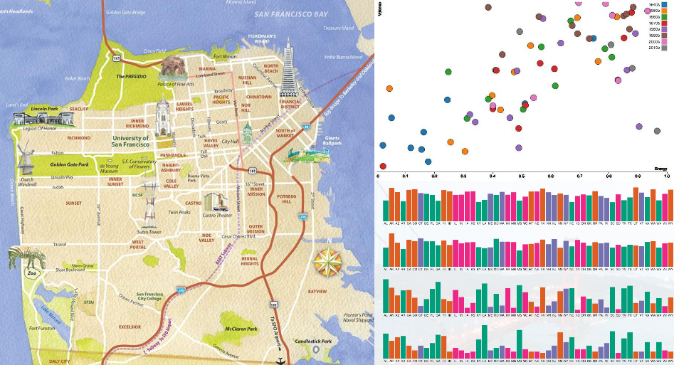
- I plan to implement a map view of San Francisco to visualize several columns in the data. I will use a drop down menu to allow the user to choose between metrics to visualize on the map. For this visualization, I will use the columns pertaining to crime rate, overcrowding rate, percent below poverty rate, high school degree rate, and employment rate for the user to choose between.
- I will implement a bubble chart showing the hazard risk columns in the dataset (percent of land area in flood zone, percent of land in high heat vulnerability zones and percent of land area in liquefaction or landslide zone). These will be x-coord, y-coord, and bubble size. Then, the color of the bubbles will be the categorical hazard score.
- Lastly, I will implement a small multiples bar chart. Each bar will be one neighborhoood and each individual chart will show a different metric from the data (to be determined).
Planned Interaction
- As stated above, for the map view of San Francisco, I will implement a drop down menu for the user to choose between metrics to visualize on the map.
- For both the bubble plot and bar chart, I plan to implement a tooltip to show details-on-demand for each neighborhood.
- I would like to implement sorting of the small multiples bar chart. For this, I hope to allow the user to choose which metric to sort by, then each one of the multiples will be sorted by that metric.
- I may also try to implement some interactivity between charts, such as when the user hovers over a neighborhood on the map, in the bubble chart or the small multiples bar chart, it highlights the neighborhood across charts and fades the other neighborhoods on the chart.
Planned Interface